inktober 2025
the tutorial i needed at the start of this journey
In 2025, I thought I'd finally be able to Do Inktober.
I've liked working with ink recently, and doing something every day of a month was appealing, given the new and frightening amount of unstructured time I have as a newly-graduated, largely-unemployed young artist. Unfortunately, the prompt list really didn't suit me, and I found my ink skills unsatisfactory.
So I looked for some tutorials. These seemed to fall into two categories:
- "Follow along my 27 step process to draw this specific owl."
- "Did you know?? WATER can be used to DILUTE your ink."
The Bob Ross
The First Day On Earth
Nothing that described the interactions between ink, brush, water, and paper, and nothing much that suggested how to find out.
So I did a series of figure studies, took notes, and made the tutorial that I was after at the start of all this.
Here's the setup I used. It barely changed at all over the month, though I did get a better sense of the value of each slot.
I have a folder of reference images, downloaded from a few free sites, which links I will definitely add any day now. If you're reading this, please remind me.
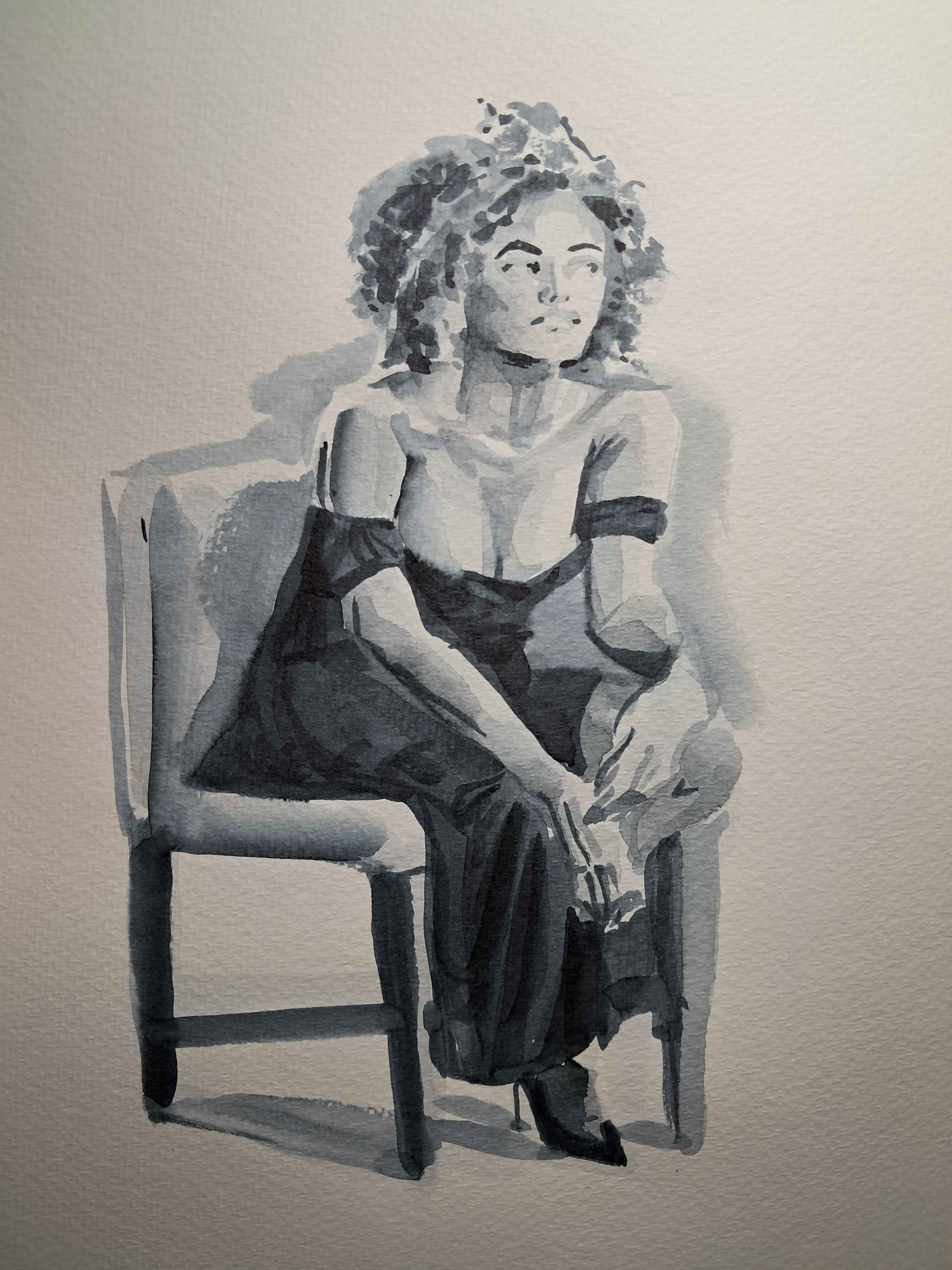
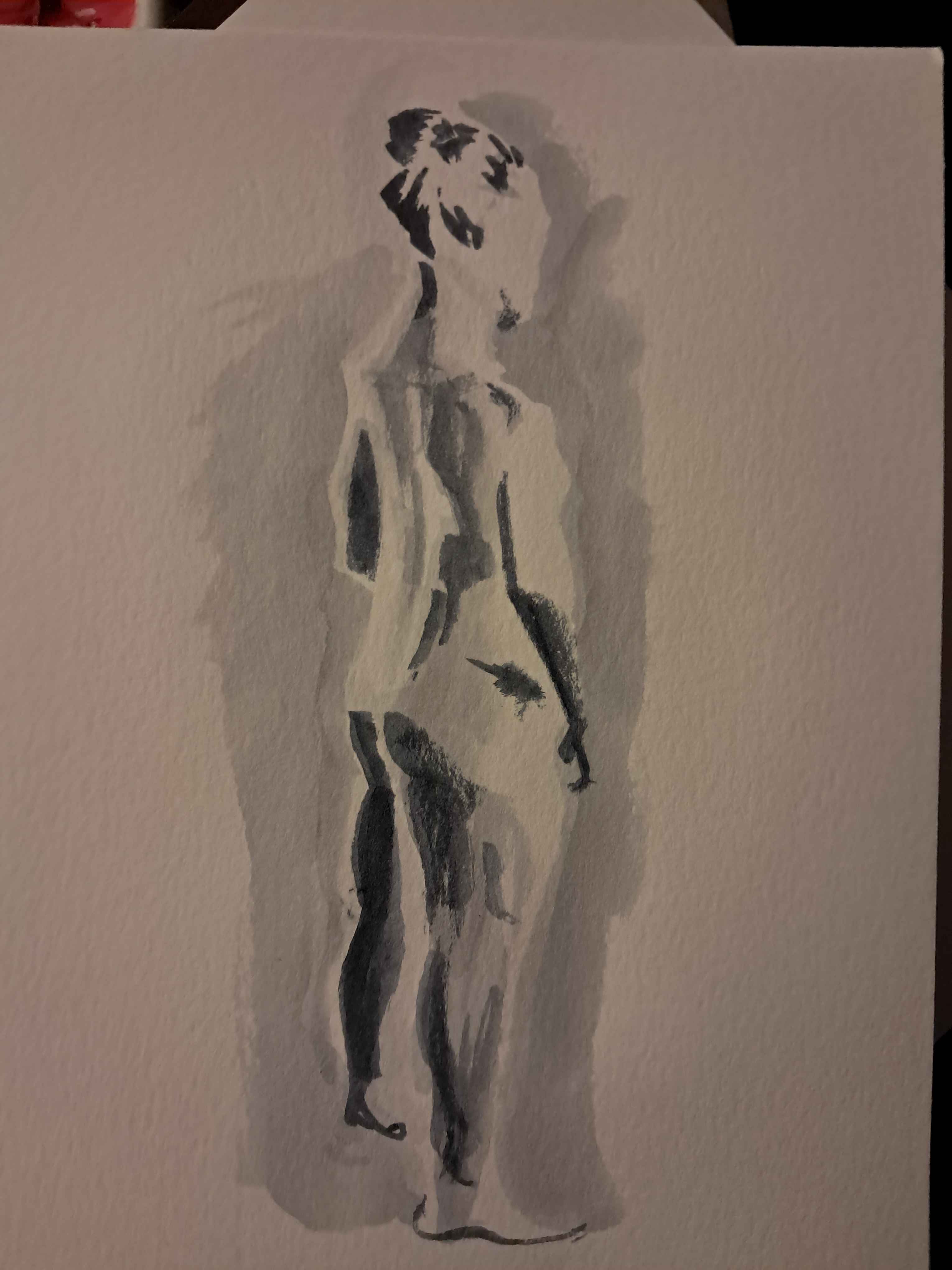
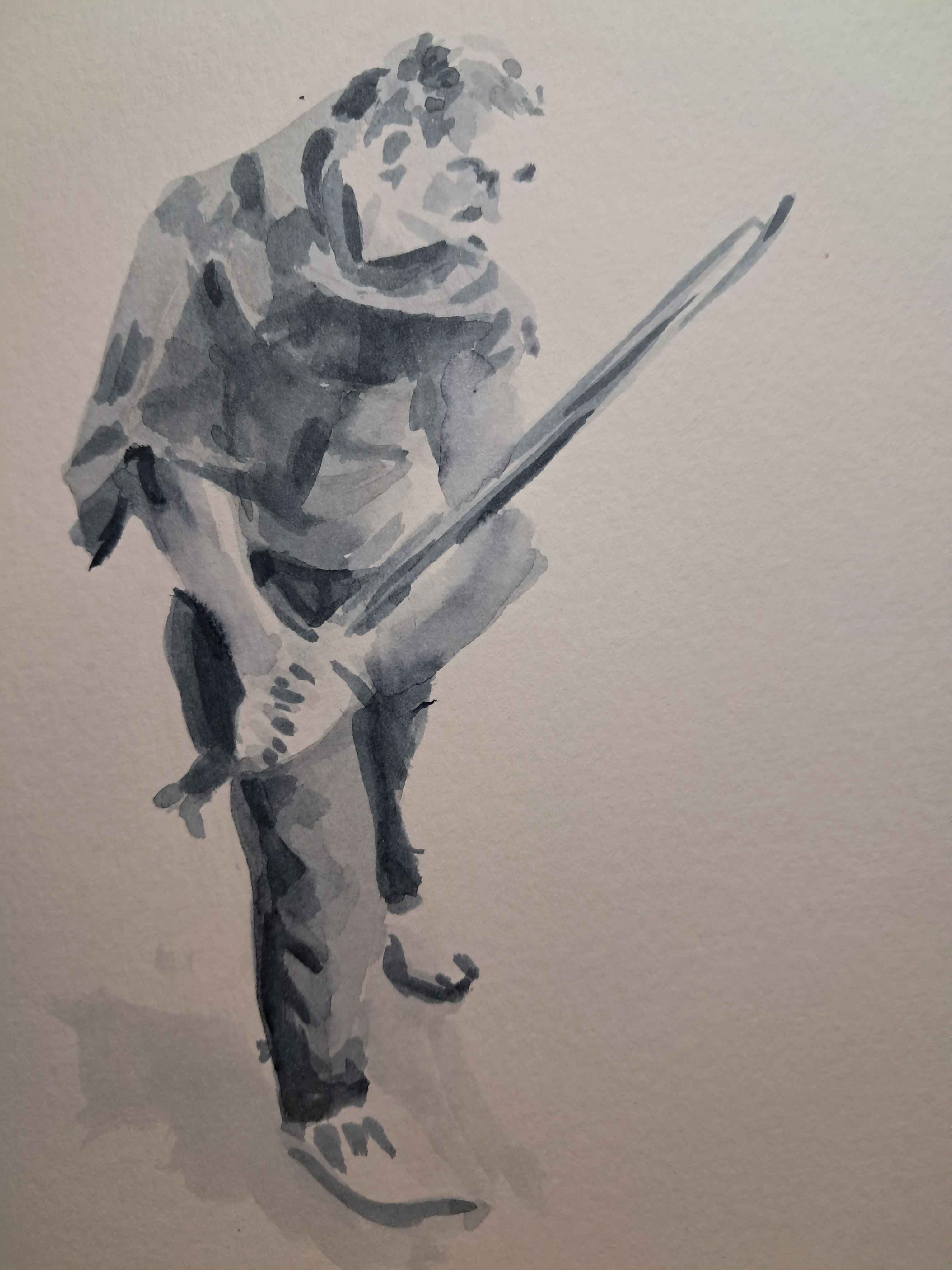
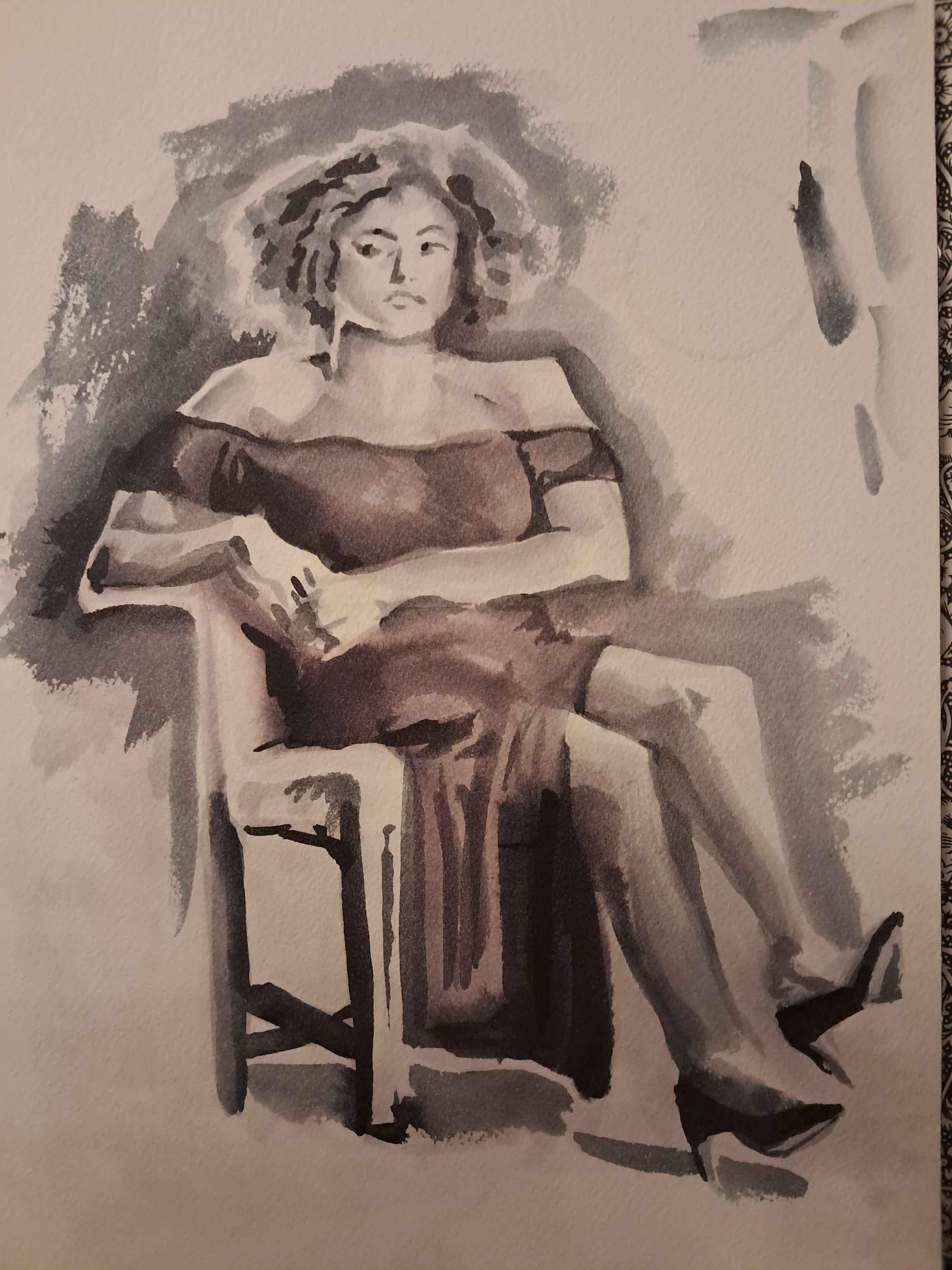
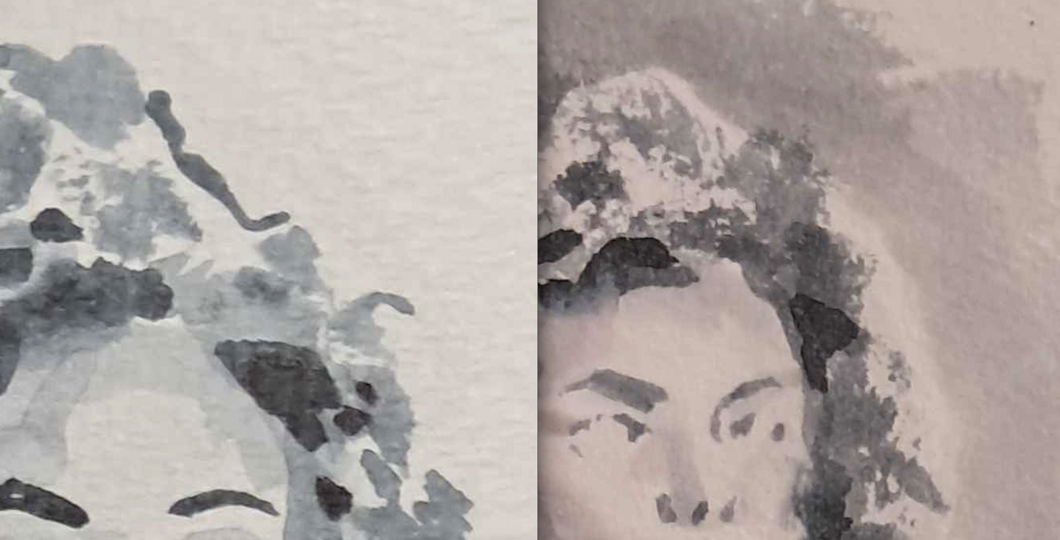
For the first image, I chose this seated pose. It's a relatively straightforward pose and the dark dress simplified the value range (of lightness to darkness).
I began with a "light to dark" method. I sketched in the pose in a light wash (water with not much ink in it), then completed shading and details on the lighter parts of the image (in this case, mostly the skintones) before blocking in and detailing the darker dress.
This process resulted in an inverted midpoint: where the light areas had been inked, and were therefore darker than the area where the dress would be. [This phrasing is tangled, fix it later.] It threw off my eye, and made it hard to estimate how dark my values actually were.
My main objection to this piece was the sharp-edged layering of washes. It made the piece feel choppier, less realistic, and didn't show off the medium to its advantage. This is the main thing I decided to work on.
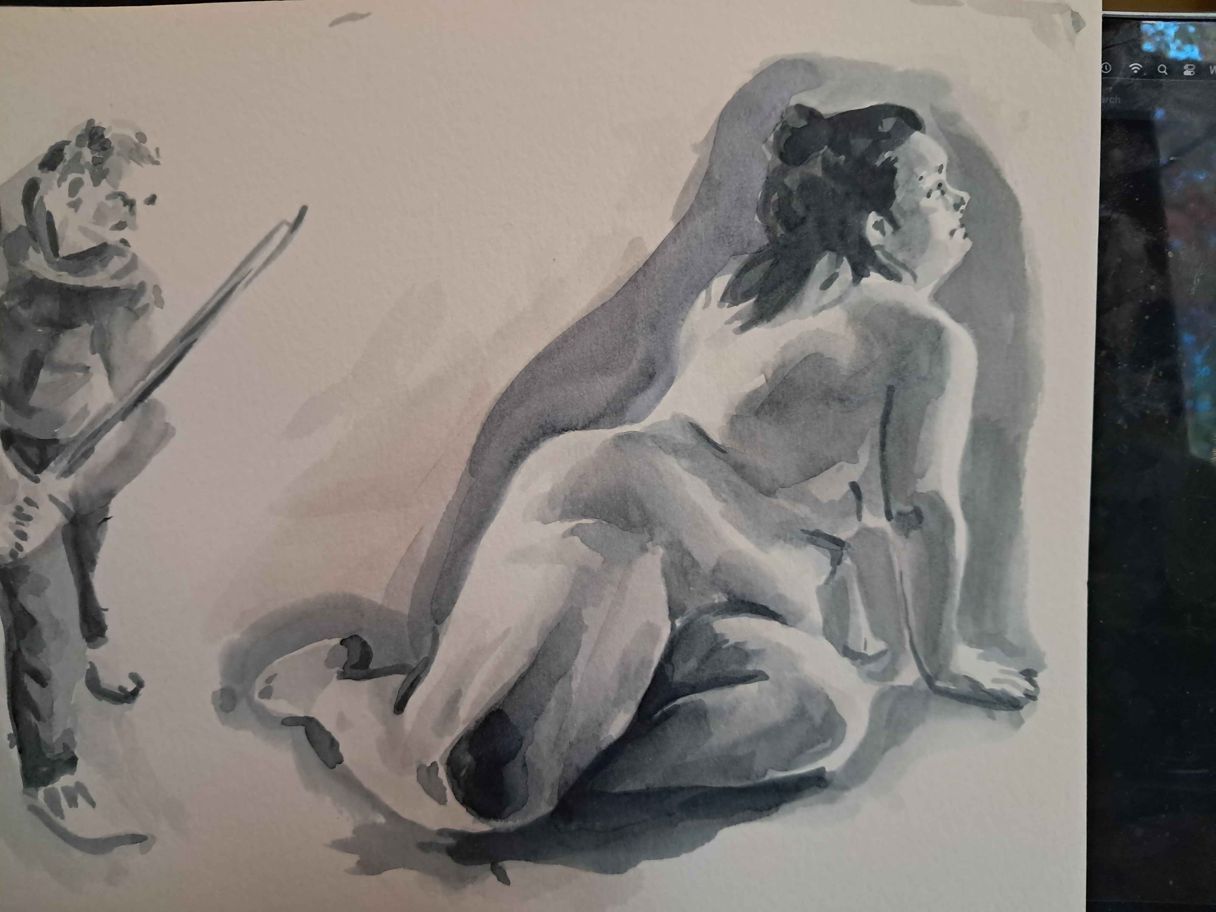
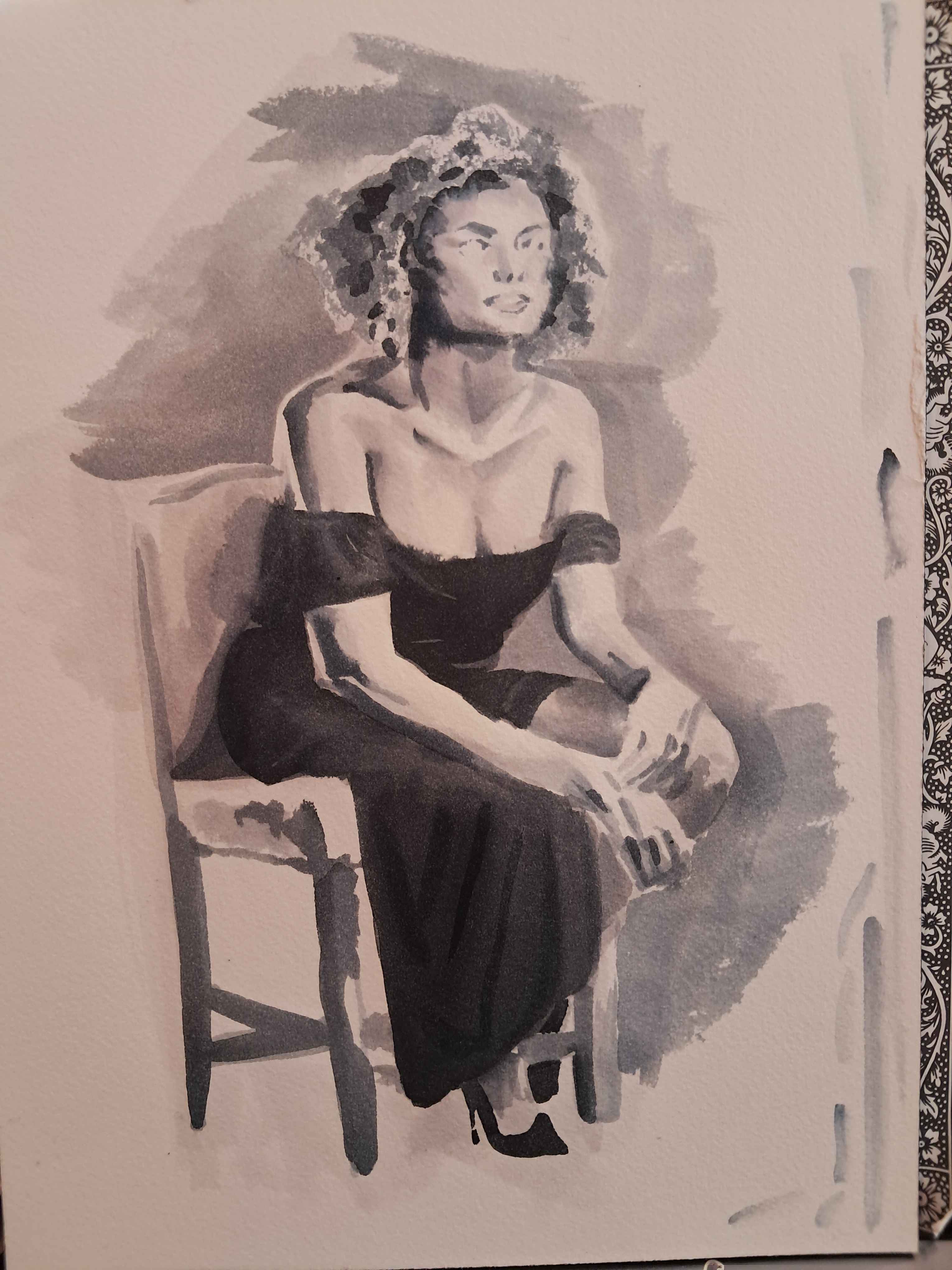
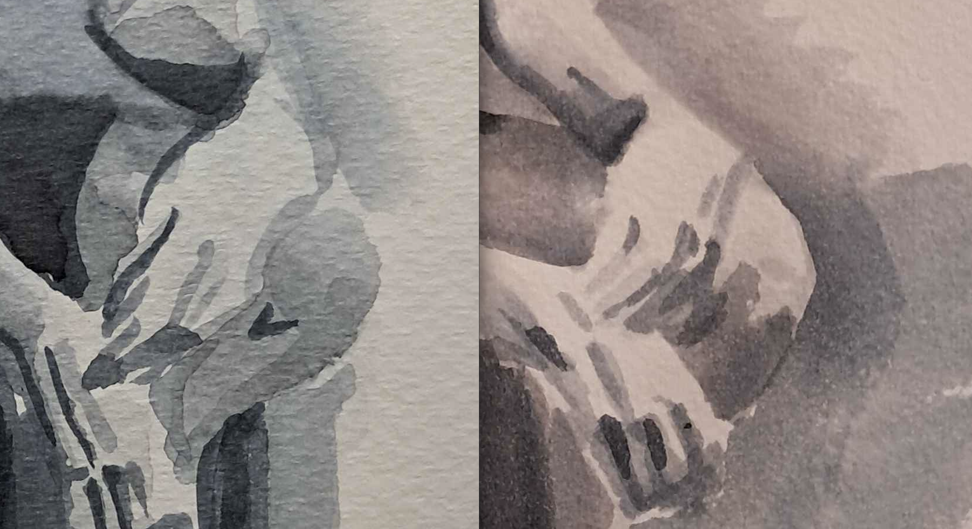
In this piece, I avoided the inverted-midpoint stage by beginning with a light sketch, then inking in the darkest darks immediately, to establish the pose and the key (how dark or light the piece can be).
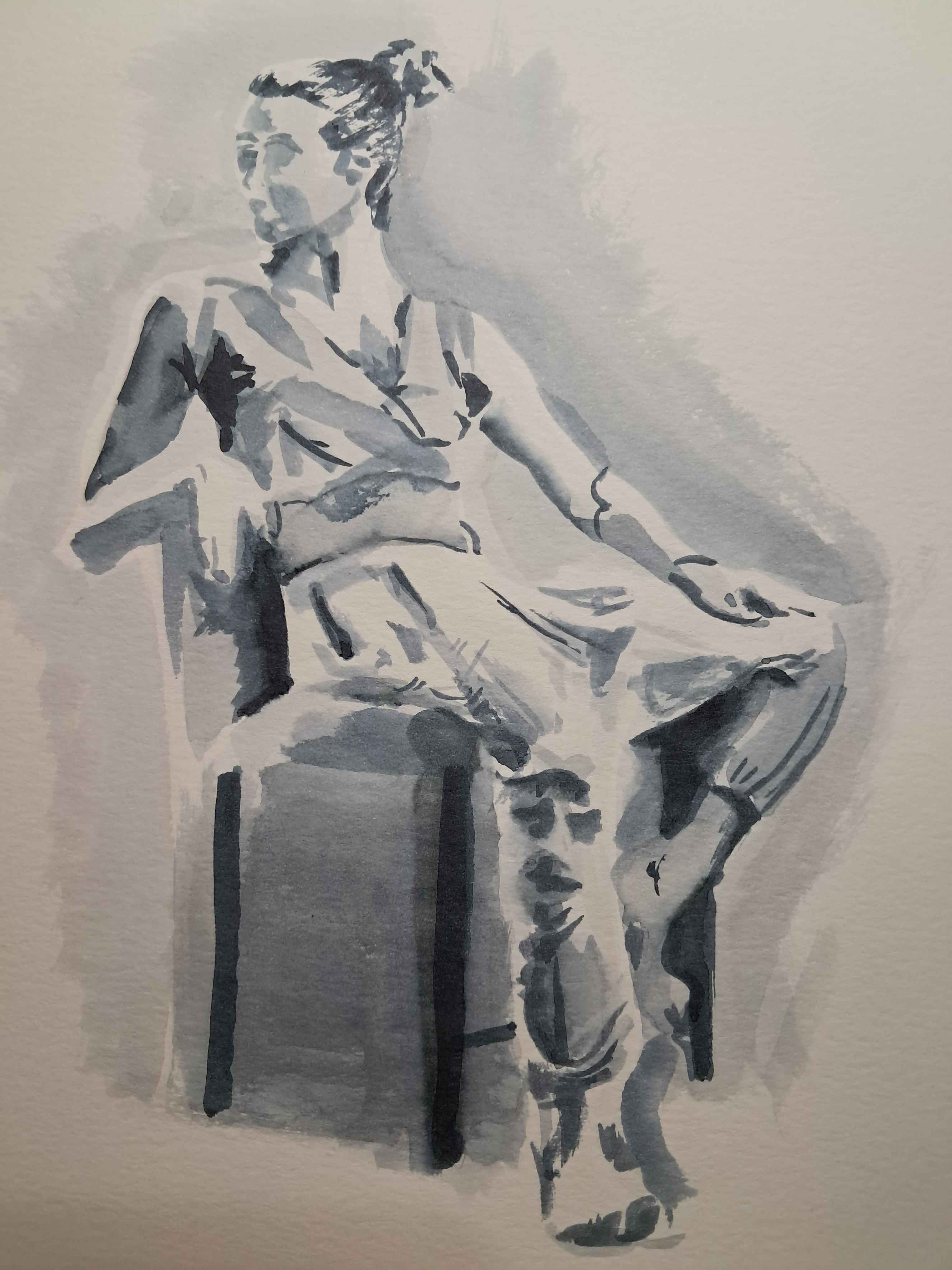
Working in this way, with very distinct value stages, resulted in a much airier piece. The lightest values, the white of the paper, were largely intact at the end, and the form is made of more disconnected marks.
I had some trouble layering values. The front leg of the chair was a dark wash with a lighter wash laid over it before it had fully dried, and the ink bled, creating a watery effect that I didn't intend.
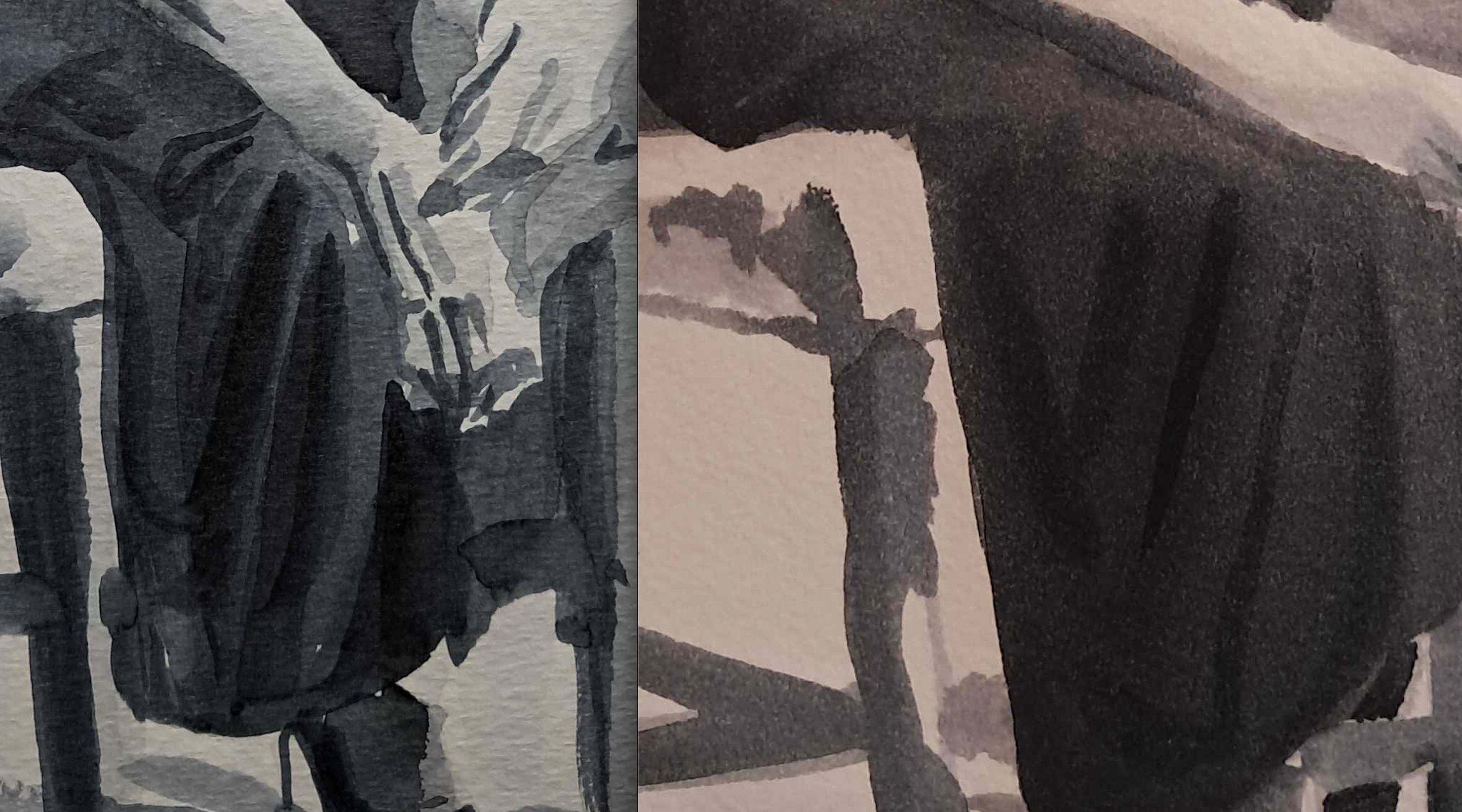
At this point, I guessed that the most successful method would be breaking the image into distinct areas, darkening each area to its lightest shade, and then inking the darks and details one area at a time.
I tried that the next day, found I didn't remotely have the patience for it, and tried something else:
- Working in one area, add a SMALL amount of ink directly to the darkest zone. Immediately dilute the brush, then be sure it is mostly dry, and maneuver the ink around the area, using the dry body of the brush to lighten and the inked tip of the brush to darken. In this way, the form of an entire area, and the full value range, can be defined in one involved and complex stroke.
- Add sharp darks (eg. outer contours) after the area has dried.
This had an efficiency that I found very exciting.
I also figured out that I had way too much liquid on my brush. The water and ink kept moving after I finished a given stroke. I needed just enough to cover the paper, but couldn't tell how much that really was.
I still wasn't sure whether this would work best with smaller areas at a time, or with less of the value range at each stroke.
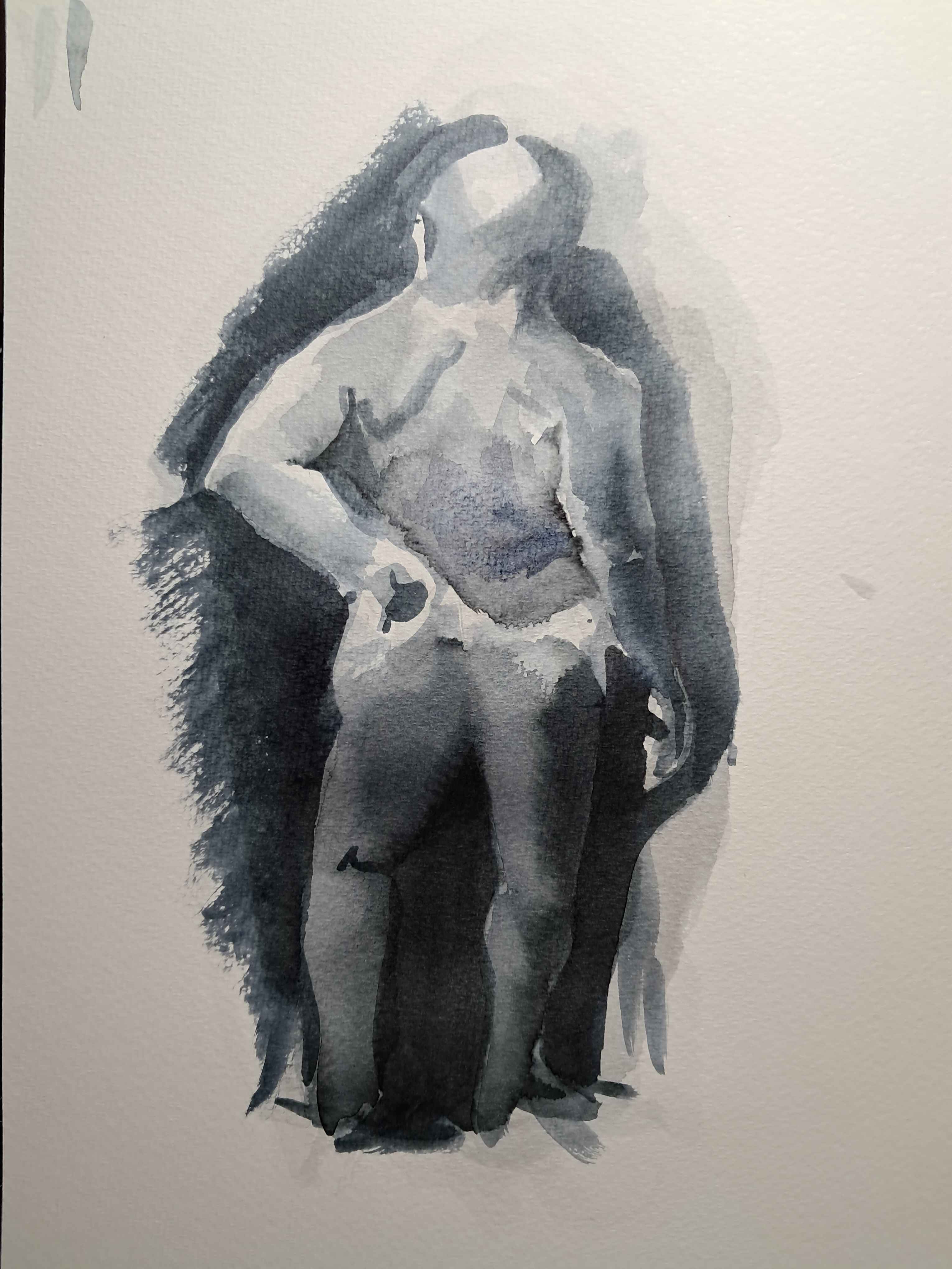
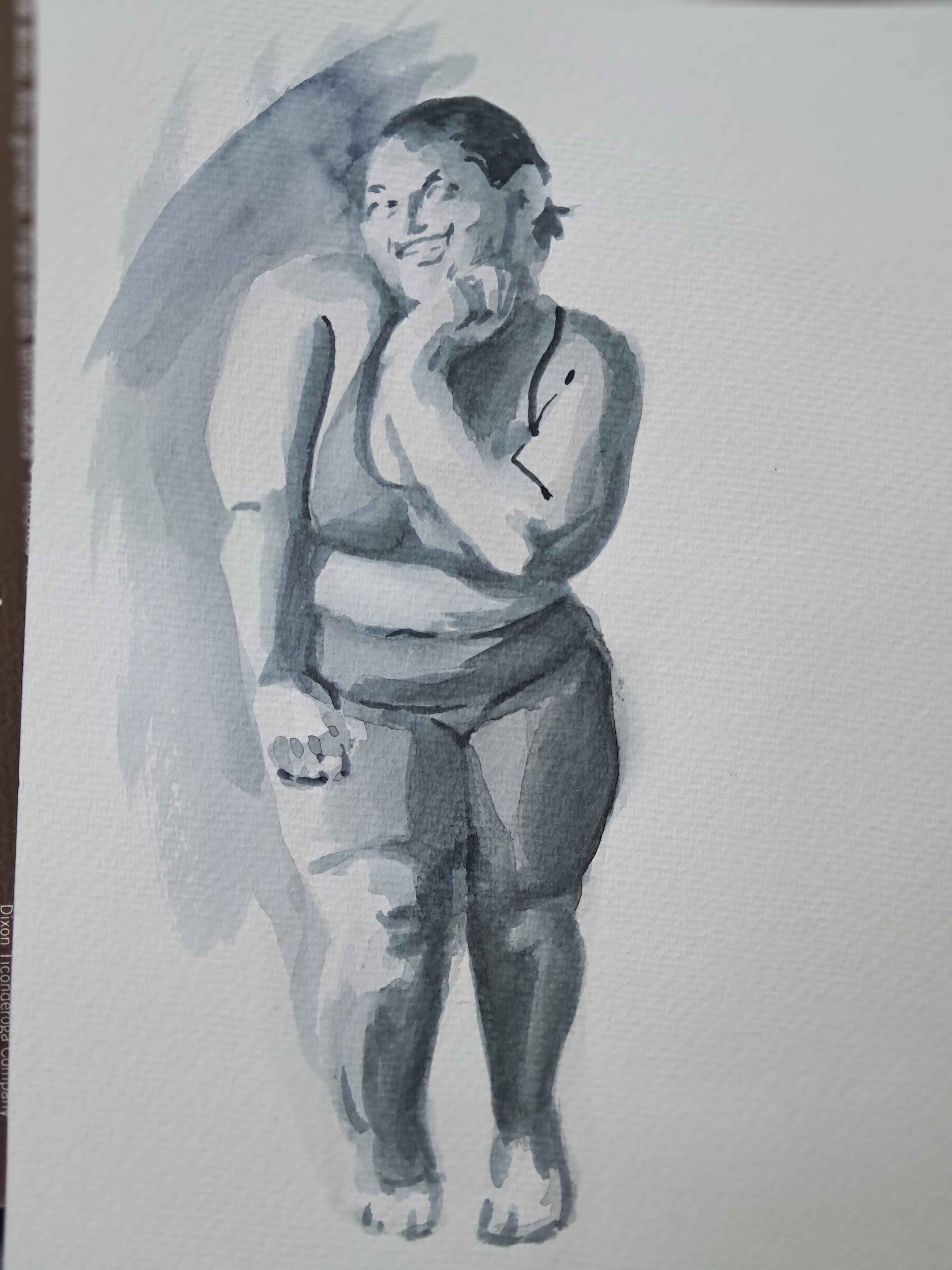
In this image, I figured out that a little ink goes a lot further than I'd thought.
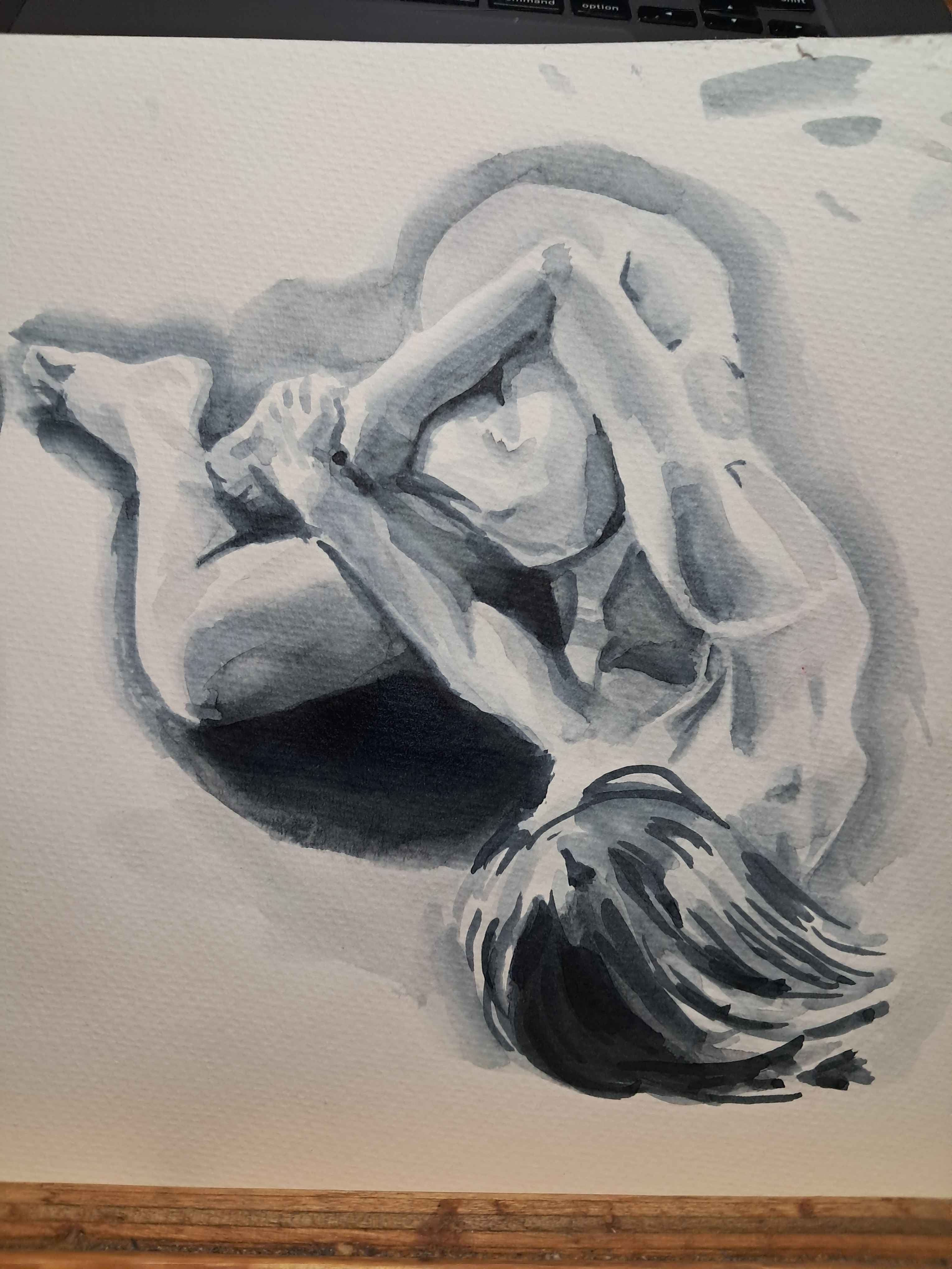
The wet-into-wet method was working okay, but still had a sort of jigsaw feel left over from breaking the image into areas.
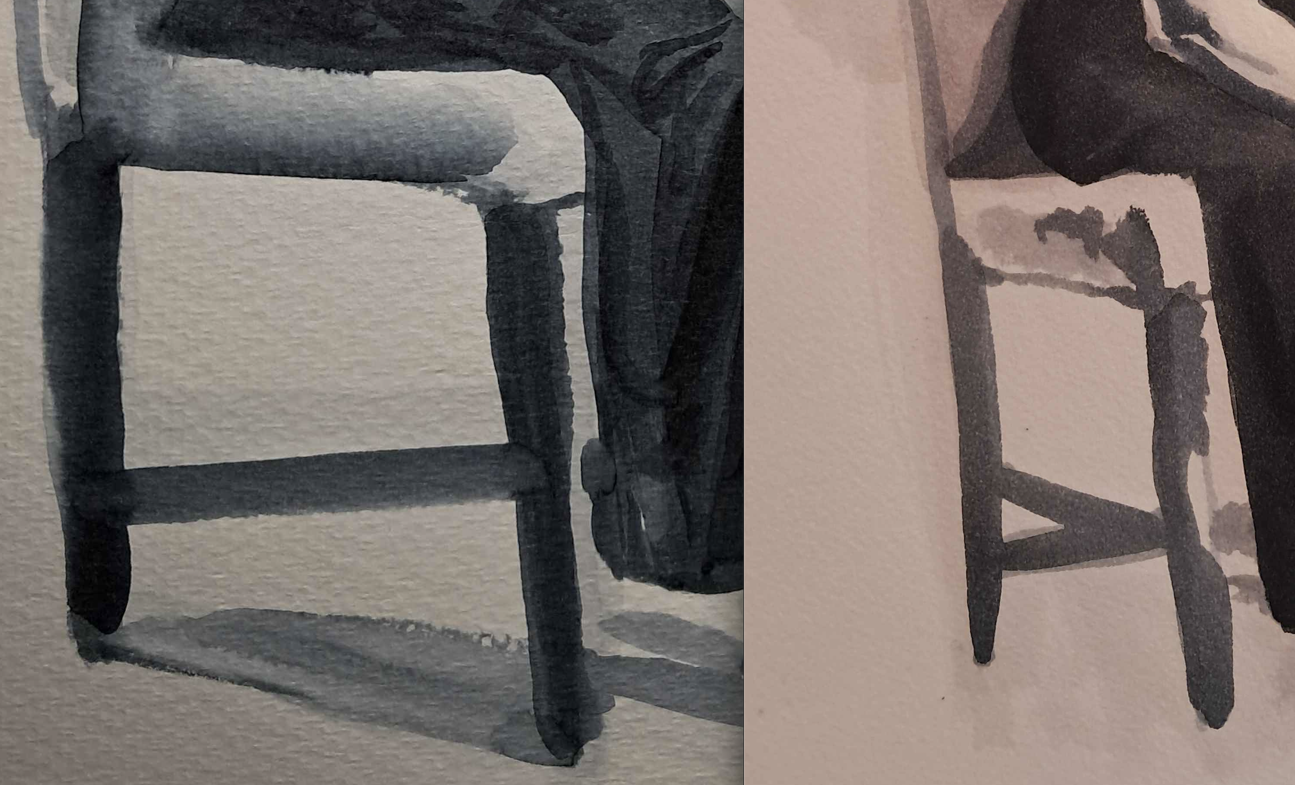
This is where I started to know what I was doing.
- instead of sketching in the contours with a line of a pale wash, use the pale wash to delineate each side of each line of contrast. Block in the dark side of the line, blur out to a soft edge. At this point, the manner of the blurred line does not matter as long as it doesnt intrude on any other lines.
- This results in a minimal necessary coverage, meaning that I can work my way around the composition of the page as necessary, rather than having to get each form in its entirety correct the first time. WAY BETTER.
- Once the pale wash has defined where the form goes, start defining each area's key. Lay in the soft-edged value minimums of each area. Aim for the edges to be accurate to the form but it'll be mostly managed later.
- Now is the time for the previously-mentioned wet-into-wet method. It works now because everything else has been defined, and because the value range of each area has been limited, so I can move around the composition as needed. After this step, the darkest areas will still need darkening, because one layer of ink is just not all the way dark, so be bold!
- Finish by adding the darkest darks.
This was way closer to smooth, deep, accurate gradient forms.
This seemed to be working, and I had new questions.
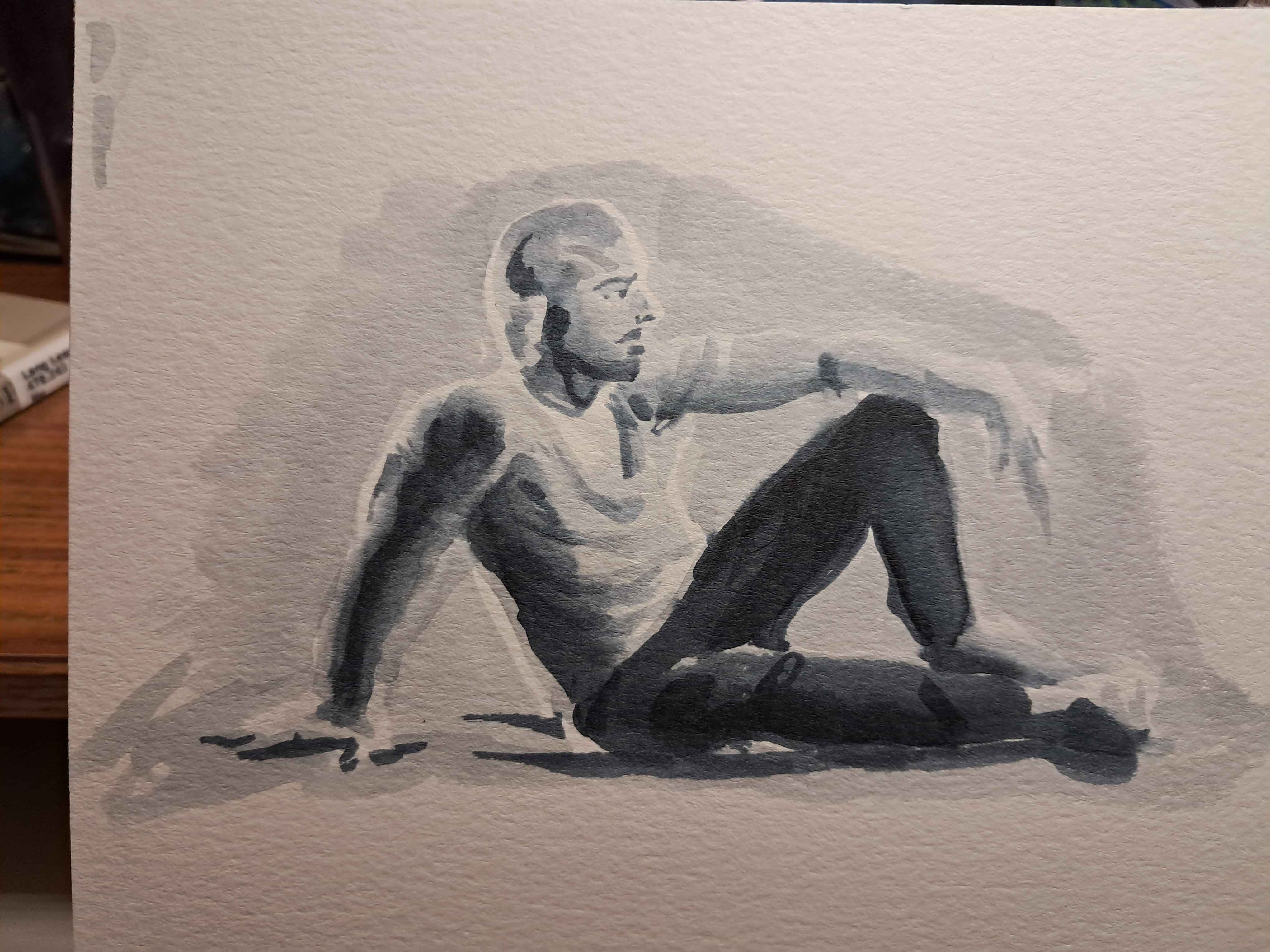
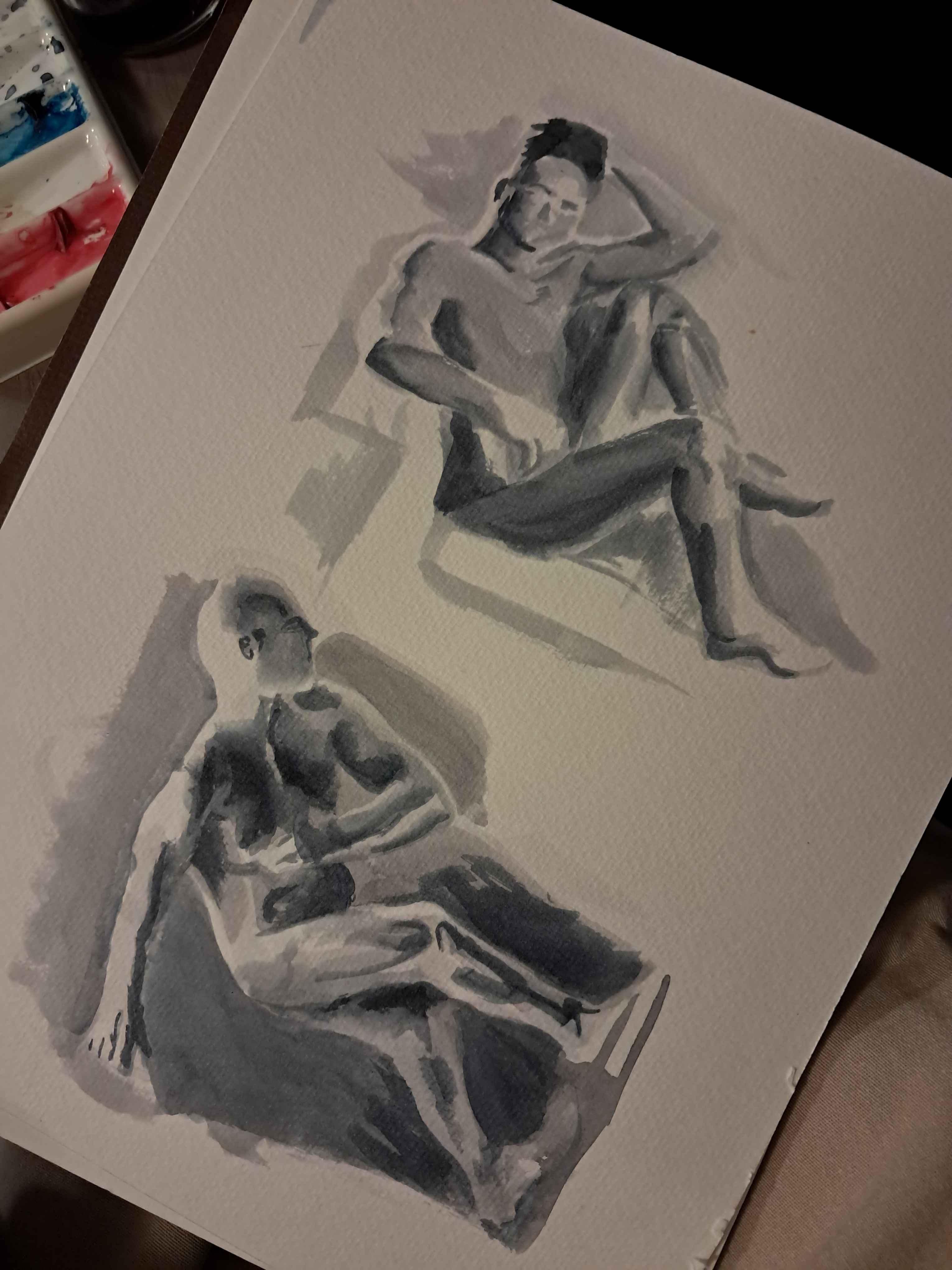
Those questions were not answered by this piece, which was done a full week later when I'd lost some of my feel for ink handling, but was still ....fine.
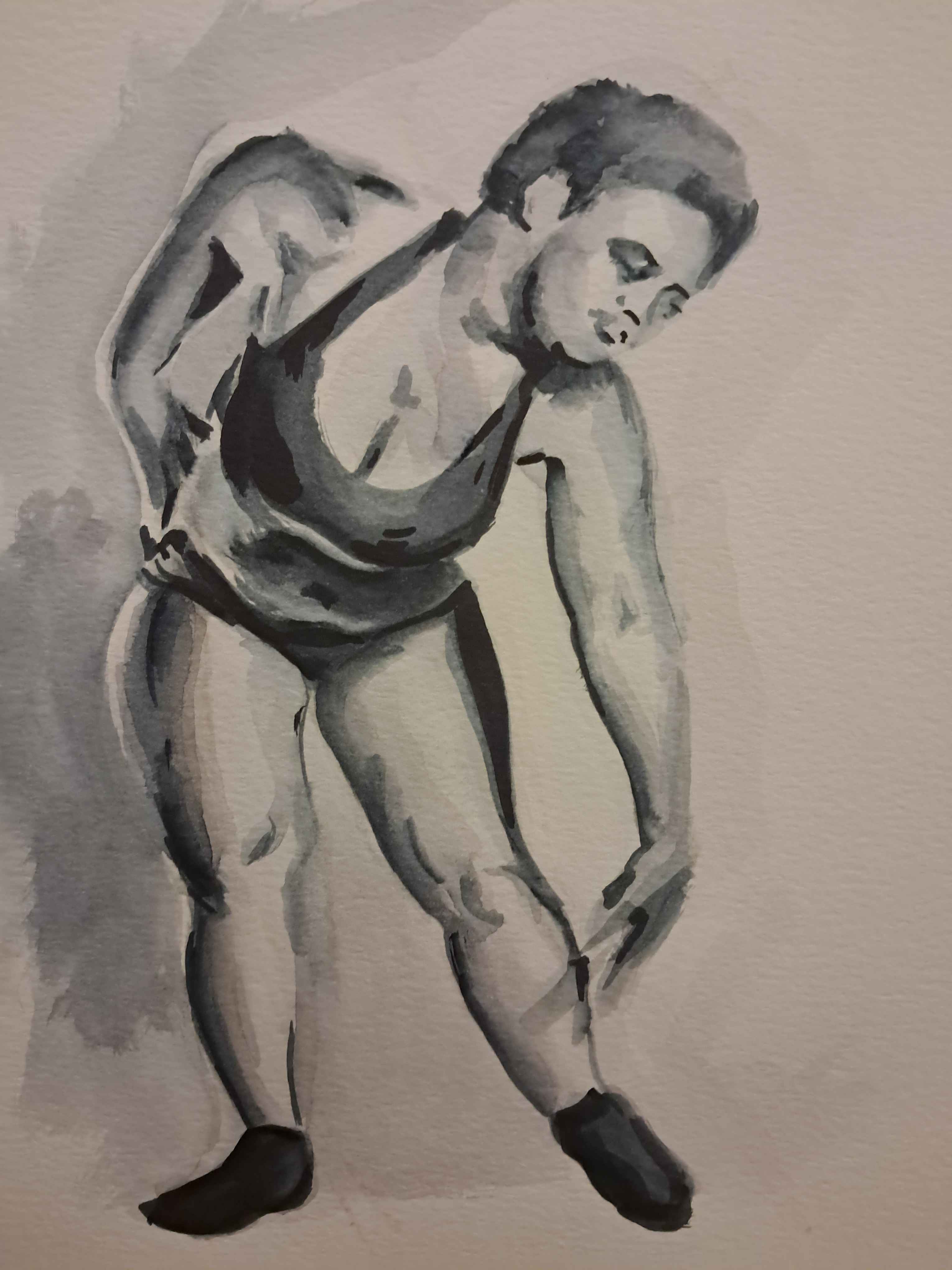
This felt better. I began with large gradient forms, generalized across the abstracted shapes of the body, then worked down to the details.
This piece felt like a small step forward, but had a better value hierarchy than some of my other works. The relation of the darks to the lights across the whole piece, and the relation of the darks and the lights to each other within an area, felt about correct.
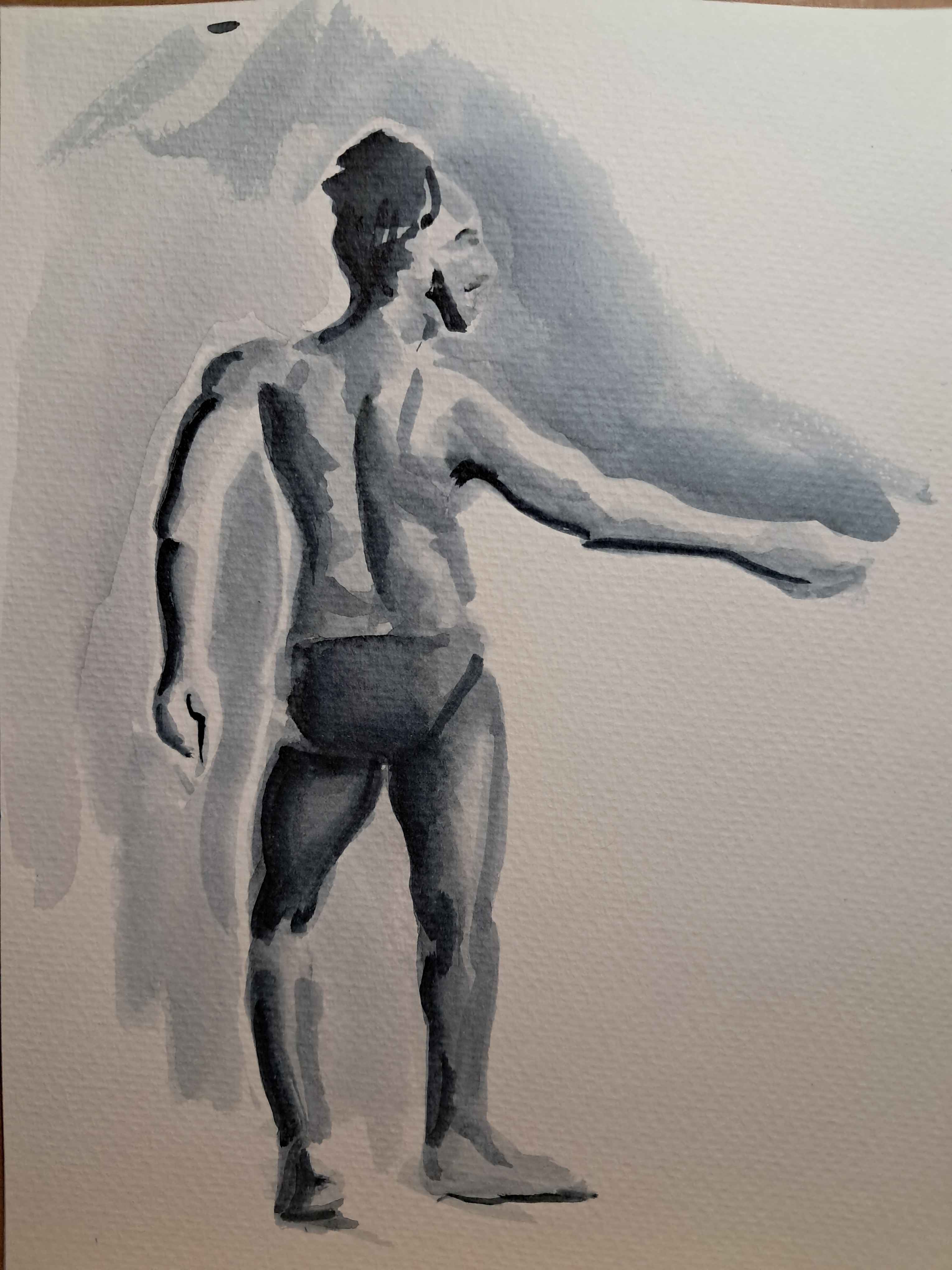
This was the most challenging pose I did all month, making up for the previous day's very simple pose. It felt like a real milestone in terms of ink handling, gradient success, and fully darkening the darks.
I'd meant to redo the first image at the end of the month, but mistook the reference image, so here are two different final ink portraits.
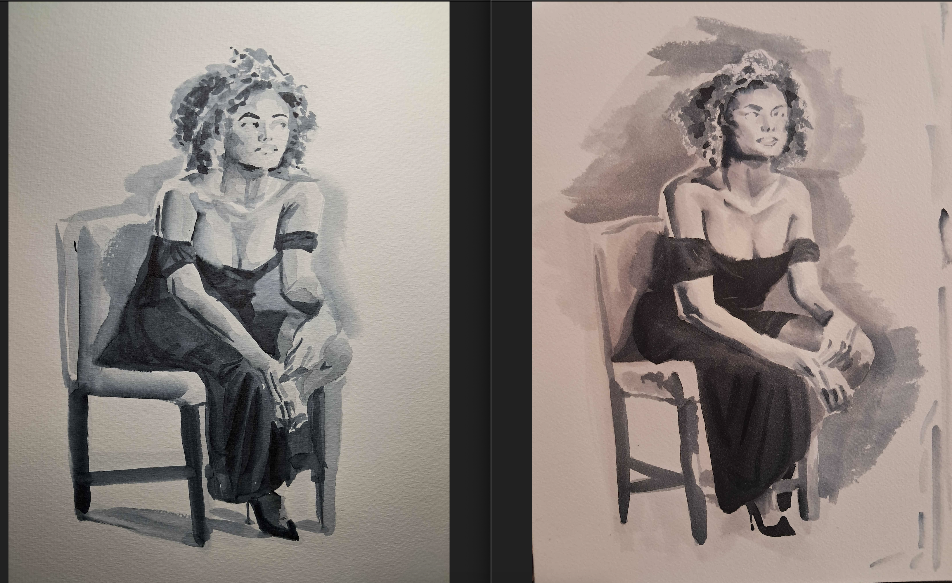
The proportions are, frankly, better in the first piece-- maybe I was tired. But the point of the exercise was ink handling, and that did improve significantly over the month.